
01
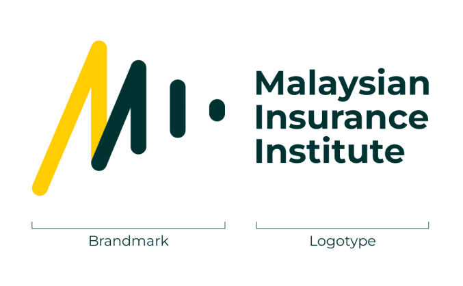
The MII Logo
Making Waves
The acronym is smartly stylised to demonstrate depth, as we move towards our goals. The letter M is shaped like peaks, which lends to conquering challenges and rising to the top.
The green lines signify a forward icon, indicating progress as a company, and for the clients, progress in their career.
The logo reminds us of where we came from, and where we want to go. It informs all the core elements of our visual identity.
02
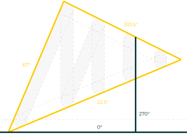
Movement Markers
Noticed the slanted lines in this playbook? Say hello to our Movement Markers, inspired by the triangulation of the new MII logo.
Movement Markers must be the same angle as the triangulation, as demonstrated here.
Movement Markers can form triangles or trapezium, and be used as design elements across MII’s communications.
03
Typeface
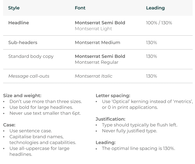
The Montserrat font is used for all communications and is available in a range of weights and styles.

04
Imagery Components
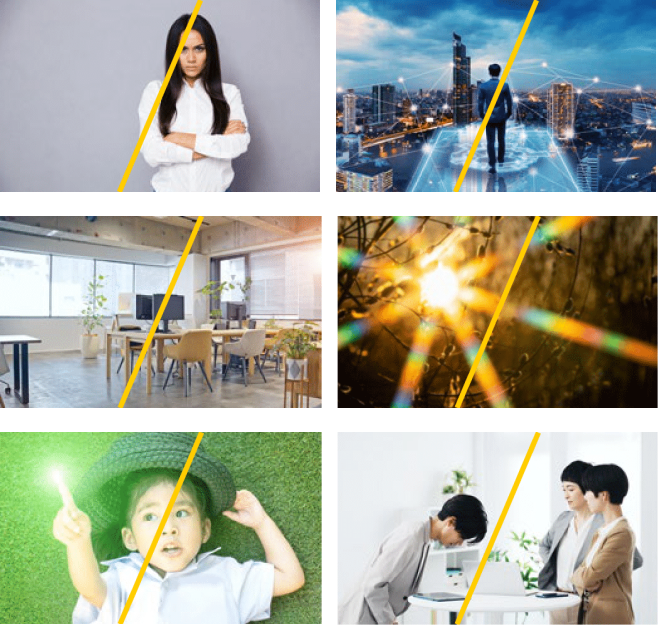
Overall mood
Exude Natural Warmth
People
Whenever possible, opt for candid-looking shots. People and family in happy mode; smiling faces enhances approachability.
Places and objects
Try to capture or create shots that evoke an ‘in the moment’ feeling.
Motion
Whenever possible, try to pick photos with backgrounds that are clean. Bonus if there’s a good depth of field.
Colours
Hues of the MII yellow and green should always be present, albeit in a natural way. Avoid resorting to photoshop.
05
Imagery Components
Images to avoid:
- Typical stock clichés, staged interactions or unrepresentative of real life.
- Heavy use of Photoshop for special effects/overlays and blended with illustrations or icons.
- Images that lack human representation, such as empty room, etc.
- Lens flares.
- Fingers pointing.
- Images that cause offence in certain markets.
- Screenshots lifted off search engines.
06
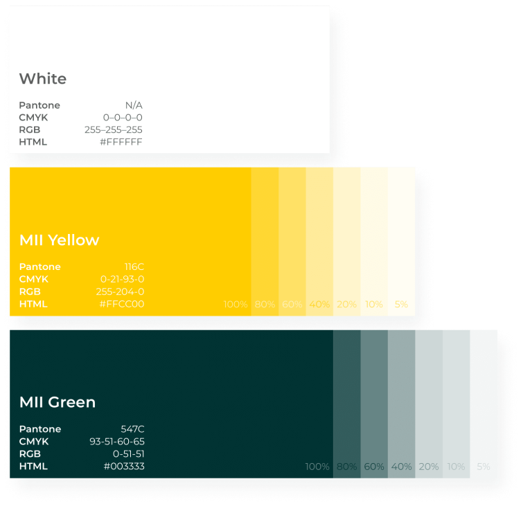
Primary Colours
MII Green and MII Yellow are the primary colours to represent the organisation as a whole.
MII Green’s dark hue signifies a sense of trust and security, while MII Yellow’s bright hue contrasts that by signifying modernity and vibrancy.
Use 80%, 60%, 40%, 20%, 10% and 5% hues to create contrast in illustration and data visualisation. Always use
100% for fonts.